AIXINLAI
Aixinlai is a textile finishing brand based on local industries. After more than ten years of market experience, it has upgraded and transformed based on traditional textile brands. The direction of the upgrade is to rescue traditional textile brands from the lagging state, and form a level docking with the fashion industry, design industry, and consumer goods industry.
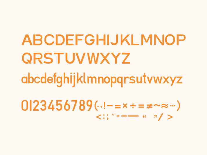
The shape of the logo is based on the shape of the English letter "A", combined with the concept of the most representative element in the textile industry, and the font design is carried out. The square frame is taken from the shape of the traditional Chinese element seal, and the introduction of the Silk Road originated from The meaning of China. The combination of western characters and traditional Chinese elements means that the brand not only has an international vision and ideas, but also does not forget the original enterprise spirit. We choose bright orange as the brand color to show that the purpose of brand upgrade is to inject vitality into the transformation of traditional industries, representing the younger, new and more creative force in the corporate culture.
Service
Brand&Visual Identity
Client
Suzhou Aixinlai Textile Co.,Ltd.
Location
Suzhou, China
Time
Apr. 2021
Team
Creartive Director
Art Director
Designer
Sha Feng
Jiayi Lu
Sha Feng, Li Peng
Award
2022 Design Annual,Graphis Inc.| USA | / Silver award


