A TIBETAN TEA
A TIBETAN TEA, the brand name symbolizes "the first one advocating a healthy lifestyle of drinking a cup of Tibetan tea". A Tibetan Tea is the originator of black tea in China and the world. It has a history of more than 1300 years since the tang dynasty. High-quality Tibetan tea has many benefits for human body.
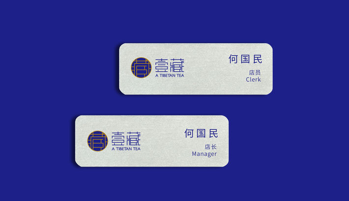
Logo graphics choose the circle, and the Tibetan character contained in it, the circle shows the existence of all things, but also reflects the unique inclusive Tibetan tea, but also a symbol of the A Tibetan Tea round like beads taste. The color uses the royal blue collocation gold, the blue symbolizes the plateau clear sky, the royal blue also appears simple and elegant; color gold is the symbol of the foot of the Tibetan tea and culture of the land. The two colors complement each other, collision together, combined with the logo and standard font of the unique graphics and meaning, shows the brand culture and history, easy to spread and remember.
Service
Brand&Visual Identity
Client
Shanghai Zangya Industrial Development Co.,Ltd.
Location
Suzhou, China
Time
Jan. 2018
Team
Creartive Director
Art Director
Designer
Sha Feng
Jiayi Lu
Sha Feng


